- Wireframes
- Flow diagrams
- Graphics
- Proposed Content
- Logo and Heading designs
- Interface designs
- Page mock-ups
Tuesday, 19 January 2010
Pitch!!!
Two weeks after today (Brief), i am expect to set up a pitch in class, where i will show my designs and ideas to the group and tutors. I have to include my proposed content, layout, interface designs and look and feel in my pitch. The ideas to include-

New Assignment- HTML/CSS
After having a class debate i have been able to choose Video Editing as my aspect of Digital Media Design theory for my website.
Today i have been set a new Assignment. What i have to do is research, Design and Build a website. The website is based on an aspect of Digital Media Design theory, which is useful for anybody thinking of taking the course. Because it is made for people who are thinking of taking the course, i have to introduce the topic assuming they have no knowledge on the subject, but i am allowed to go beyond the basics. It is not a software skills website; it is purely about the design Principles. For example, i will cover why it is useful for a video editer; designing/drawing a storyboard before video editing and creating a movie, rather than going straight into it and making the video's.
I have to make a website by using code in Text Wrangler and no programs like dreamweaver, we will be constructing the website by writing with CSS and HTML.

TextWrangler- this is the software i will be using to create my site.
Today i have been set a new Assignment. What i have to do is research, Design and Build a website. The website is based on an aspect of Digital Media Design theory, which is useful for anybody thinking of taking the course. Because it is made for people who are thinking of taking the course, i have to introduce the topic assuming they have no knowledge on the subject, but i am allowed to go beyond the basics. It is not a software skills website; it is purely about the design Principles. For example, i will cover why it is useful for a video editer; designing/drawing a storyboard before video editing and creating a movie, rather than going straight into it and making the video's.
I have to make a website by using code in Text Wrangler and no programs like dreamweaver, we will be constructing the website by writing with CSS and HTML.

TextWrangler- this is the software i will be using to create my site.
Friday, 15 January 2010
MY BOX ALL FINISHED AND WRAPPED!!!
Today i took some photo's of my finished spray painted box, with stuck on viynls and wrapped in my created wrapping paper. These pictures also show the stages of development i went through, to creating my box. After seeing everything in my box and the whole finished product, it was quite satisfying. Now all to go, is crit-- FINGERS CROSSED.

This is my box first stage, all made, without spray paint and viynl applied. However all sanded off, with hindges for the door.

This pic just shows you another angle of the box, with the hindged door open, this time.

This is my box, spray painted and viynls applied. Finished product. Everything went ok, apart from, where i had masked off the box, some paint had leaked through. However, i am pleased with my efforts.

This just shows you the box, with hindges up again. Finally all i have to do is wrap the box up.
 This is my box finished and completely done. I have wrapped it with my wrapping paper i produced in Photoshop, and is in the same style as Warhol's Marlin Monroe prints.
 Another angle of the wrapped box...

This is my box first stage, all made, without spray paint and viynl applied. However all sanded off, with hindges for the door.

This pic just shows you another angle of the box, with the hindged door open, this time.

This is my box, spray painted and viynls applied. Finished product. Everything went ok, apart from, where i had masked off the box, some paint had leaked through. However, i am pleased with my efforts.

This just shows you the box, with hindges up again. Finally all i have to do is wrap the box up.
 This is my box finished and completely done. I have wrapped it with my wrapping paper i produced in Photoshop, and is in the same style as Warhol's Marlin Monroe prints.
  Another angle of the wrapped box...
Thursday, 14 January 2010
Teacher Crit.
After printing off my poster, and showing it to my teacher, i got some critique and therefore made some changes to my poster. There was clearly some vital things my poster was missing and some very obvious technique it was lacking.

The first change i made was to the Yamaha writing on the top left block. (well actually i changed all of them to capitals). Then (top left) i added a white drop shadow to this, like the original has.
 Then the most obvious change i made, was to the two bottom Yamaha writings. I changed the colour of the blocks surrounding them, to a pale red; like the originals.
Then my teacher noticed that there was something not right with the actual character. It was lacking a sort of poster effect, rather than it just simply being cut out an image and stuck into another. Here are the techniques i used to make it alot more effective and more like the original. First i had to check out the different sort of filter effects, and blow me down, there was a posters edges effect. Then to finish it off, i played around with the colour and contrast adjustments.


This was my end result.... (By the way, which i am very
very VERY HAPPY WITH)


My last adjustments to the poster, was simply just adding in the black outlines of the colour blocks and the thick black lines seperating the squares (shown in the two pictures surrounding this text).

 Then the most obvious change i made, was to the two bottom Yamaha writings. I changed the colour of the blocks surrounding them, to a pale red; like the originals.
Then my teacher noticed that there was something not right with the actual character. It was lacking a sort of poster effect, rather than it just simply being cut out an image and stuck into another. Here are the techniques i used to make it alot more effective and more like the original. First i had to check out the different sort of filter effects, and blow me down, there was a posters edges effect. Then to finish it off, i played around with the colour and contrast adjustments.


This was my end result.... (By the way, which i am very
very VERY HAPPY WITH)


My last adjustments to the poster, was simply just adding in the black outlines of the colour blocks and the thick black lines seperating the squares (shown in the two pictures surrounding this text).
Creating an A5 Booklet for my essay, in InDesgin
Yesterday i created my essay A5 booklet. This was created in the same software as i chose to do my leaflet in (In Design). After picking up the basic techniques it was fairly straight forward. First i created my pages as shown below.

This is the pages window. As you can see i started off with one page on a simple document. All i have to do now is add the pages...

Here all i had to do is select the top right thumbnail and simply drag it underneath my main page, creating 2-3 pages. After placing my text in, i relaised i would have to create more pages.

After reading through the brief, i realised that i would have to created Character and Paragraph styles for my text. This picture shows you the Paragraph style window, the Character one is exactly the same, however, it is a different window option. All i have to do now is give the style a name, and select the font and sizes i want it to be.

This is one of my paragraphs i applied to my main body text. As you can see it is generated by Helevitca font and size 10.
These next pictures show the text before and after the Paragraph style was applied.

 :Before

This is a character style, which i will apply to random first letters of a paragraph, rather than the whole paragraph.

Then i wanted to personalise this character style even more by, using the window drop down menu, clicking on type & tablets and selecter character, shown in the picture.

This is the character window. All i changed was the bottom option, where it says -3. I did this because this means how many lines the letter drops down to. Vise versor, if it was +, that would mean to say how many lines the letter climbs up.

This was the effect from the character style and the character format.
Lastly, i create one more paragraph style to my Bibliography page.

Times New Roman, Bold, Italic and size 14

This is the pages window. As you can see i started off with one page on a simple document. All i have to do now is add the pages...

Here all i had to do is select the top right thumbnail and simply drag it underneath my main page, creating 2-3 pages. After placing my text in, i relaised i would have to create more pages.

After reading through the brief, i realised that i would have to created Character and Paragraph styles for my text. This picture shows you the Paragraph style window, the Character one is exactly the same, however, it is a different window option. All i have to do now is give the style a name, and select the font and sizes i want it to be.

This is one of my paragraphs i applied to my main body text. As you can see it is generated by Helevitca font and size 10.
These next pictures show the text before and after the Paragraph style was applied.

 :Before
 After:

This is a character style, which i will apply to random first letters of a paragraph, rather than the whole paragraph.

Then i wanted to personalise this character style even more by, using the window drop down menu, clicking on type & tablets and selecter character, shown in the picture.

This is the character window. All i changed was the bottom option, where it says -3. I did this because this means how many lines the letter drops down to. Vise versor, if it was +, that would mean to say how many lines the letter climbs up.

This was the effect from the character style and the character format.
Lastly, i create one more paragraph style to my Bibliography page.

Times New Roman, Bold, Italic and size 14
Monday, 11 January 2010
Creating my leaflet
Today i have created my leaflet.
First, i had to open up In Design and create a template.

As you can see, i have created my leaflet, to be divided up into three sections. The way I will fold this leaflet, is so these three divisions are my front page, and two pages inside the booklet. However, after creating these three divisions, i will have to copy the template onto a new document, and these will be my three back pages. Al i have to do is print of one side/document, then turn it over, put it back in the printer, and print on the back of the printed copy.
Then i filled the leaflet with some colour.
Then i had to go through the following procedure to place my text/information i found into the leaflet.

After clicking on place, all i had to simply do is select the word document i had created previously, then click on the booklet, where i wanted to place my text. However, because of having so much information, i had to muck around with the text size and layout to fit all the information on all three pages. Note: It was not simply File> open to get the file in.
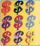


My end result............


First, i had to open up In Design and create a template.


Then i filled the leaflet with some colour.
Then i had to go through the following procedure to place my text/information i found into the leaflet.

After clicking on place, all i had to simply do is select the word document i had created previously, then click on the booklet, where i wanted to place my text. However, because of having so much information, i had to muck around with the text size and layout to fit all the information on all three pages. Note: It was not simply File> open to get the file in.


Once i found my images online that i wanted to use, i had to go through the same process (File, place etc...), but instead i had to select the different file/image that i wanted to use. Important, before doing this i had to create a rectangle box/text box to place the image in.

Lastly, i found that when trying to lay the image, in its designated place, it would just cover over the text. So the last step was to click on the windows pannel and select text wrap. After that it would bring up the window in the picture to the left. Then all i had to select is the little icon in the top left corner, which meant that the text would wrap around the text, rather than just sit underneath it. And also i could choose the space left around the image inbetween itself and the text, in this case, i chose an 0.5 cm boarder around the image, to make it look neat.
My end result............


These are my back page, where i have create a template of a timeline, which shows all the important events of Warhol's life. Right from the year he was born until the year he died. I did this by simply using the rectangle and line tools, placing text and pictures procedure and that is it.
Thursday, 7 January 2010
The making of my Wrapping Paper

As most people know, Andy Warhol is famous for his silk screen print of Marlin Monroe. I thought this would be an ideal aspect to use for my wrapping paper.
In order to create my wrapping paper, i wanted to use the same idea as Warhol, however, because Marlin Monroe was high in the ranks of fame and glamour in Warhol's day and age, i thought to myself about changing my character, that would relate to fame and glamour in my generation; so i thought to create one of Britney Spears.

The first thing i had to do is gain a picture of her, from the net.

Then using the magnetic lassoo tool, i traced around Britney's outline, to separate her from the background and just giving her outline and features. Note: I had to create a new layer and copy the image into this.
Then making sure my new layer was active, i went through the following instructions, demonstrated in the next screen shots.


The reason for creating this black and white feature, is to make the next job alot easier. This is to then lassoo out the parts of her body that i wanted to, first put in new layers, and then colour in to give Warhol's famous effect.

 These pictures either side, show you the process, of lassoo-ing Britney's face, and copying and paste it into a new layer. I had to do this three times on three different features of the body (Face, Lower Body and Hair).
Once i had created all three layer, it was time to add some colour! Here is the way i did it.


Making sure i clicked on the face thumbnail, whilst holding Apple, enabled me directly select just the face of the over all pictures. I then went to edit and fill, to give some colour options. (In this incidence i was colouring her face, however, if i was doing another feature, i would make sure i would apple click that part of the body).


Then making sure i had clicked colour in the Contents, and Use items, i had to select a colour, i wanted to fill the feature in with (i.e orange).

As you can see now, the Face thembnail has changed to Orange.

After doing these steps on every feature it gave me something a little like this. After creating the whole portrait, i would save it as a file name (i.e. brit wrapping paper one). Then i would change all the colours over, and then go save as, and change it to a new file name, allowing me to have all my portraits in different files. The next step was to insert all the files into one, to give his overall effect, with loads of different portraits, in different colours. Then lastly, i had to save the document, and then re-save it as a JPEG format, to take to the printed, to print on a large bit of paper to wrap around my box.

End result..... (AFTER A LOT OF STRESSING, AND ONE LATE NIGHT, IT WAS ALL DONE! :))
Subscribe to:
Posts (Atom)