Friday, 11 December 2009

Andy Warhol

After choosing my chosen artist/designer, i have been looking at some of his work, deciding on some ideas for my box.

His famous piece on Campbell's soup can, i have actually found the box, that the soup can are found it.


I am thinking, maybe, create my box as a replica of this, with the simular fonts and type used in the actual box. However, i think i am going to possible make my box out of wood.


This is a good design to have as a sort of wrapping paper, that would surround my box. I would modify mine slightly though, and have a different person on the front, i.e myself. Then all i have to do is take a photo of myself, place it in Photoshop, and change the channel, giving me this distinct colour effect.

Tuesday, 8 December 2009

New ideas and picking a topic!

After being set this assignment, i was fairly confused as what to do and what topic to pick. I had looked through all the topics, and nothing appeared to be interesting to me. After speaking to people, i found out that i didn't necessarily have to choose a topic on the brief, but i would have to check with my tutor, if i was allowed to do my project on this topic.
After looking at a range of other topics to base my project on, i come up with basing my project on pop art. There are several reasons for me choosing this. The first reason is because I found this topic a lot more interesting, and more 'my sort of thing'. I also did a very simular sort of project on a chosen artist back in my secondary school, which was on pop art. I chose Richard Hamilton, and i really enjoyed creating that project.

After look at a number of artists that are involved in pop art, my most favourites are Richard Hamilton, Andy Warhol and Roy Lichtenstein.

After basing my previous project on Richard Hamilton, i am more obliged to base my assignment on Andy Warhol or Roy Lichtenstein.

Below is numerous pictures, showing some of their art work:

Andy Warhol:


Roy Lichtenstein:


Monday, 7 December 2009

New Project- Time Capsule

I have been set a new project, which is to create a hand made box, that is a sort of Time Capsule. It will be based on a designer or Design Movement. In the brief their are a list of Historical Periods and Designers. These are as followed beneath:
Art Noveau
1910's flat colours
Machine Age- 1910's-1930's
Constructivists
Bauhaus
American 40's-50's
Post Modernism
The Memphis Group
Machine Stamp
Handmade

Each category has a list of desingers, within this topic area as well, that i can choose from.

I have to completely make the box hand made, which will include all my own designs over it, i.e. wrapping paper, print etc... It will consist of an A4 Posters and Leaflets, Some post cards, and an A5 booklet, which will include my essay on it.
Lastly, i will be using 3 main software packages to create this project. These are:


Adobe In Design (.indd)


Adobe Phostshop (.psd)


Adobe Illustrator (.ai)


I will have to be well aware of time management in this project, as it is divided up by the christmas holidays, so i will have to get as much work done in class, so i am not distracted at home with any luxuries.

Friday, 20 November 2009

Final 3D Boxes

Today, i finally created my 3D boxes, with a drop shadow, to give the picture definition.


This picture shows the front of my box, the top and right hand sides.


This picture shows the back of my box, the left and bottom hand sides.


NOW I AM BLATANTLY FINISHING CRIT, AND THEN GOING DOWN THE PUB!

Thursday, 19 November 2009

My overall net

Here is the finished net for my product...


Other sides of Box

Here is the other sides of my box. The first one is my right hand side of the box, which includes all the need to know information for the consumer i.e. what the product contains (ingredients). The front cover of my box, includes my animated character, with a bowl of milk and Chewy Louis's, with a small daily guideline for the consumer. The bottom of my box, includes the bar code and the products ingredients. Lastly, the back of my box has a little maze, which the children can play, when they finish their cereal.


Wednesday, 18 November 2009

Top of the box

I have just made the top of my box. Tis side of the box, was probably the mst simple to make, because, 1, it is the smallest side of the box anyway, and two, all i had to do is drag, my title on the top of the box, and create a small, box, with a sort of hand written font, for the use by date. Picture below shows you this.


What has to be taken into account, is that this is an old photo, where the screen shot has been taken with my old title on. Now the top of my box, has my new title on it.

Creation of a side of my box

Yesterday i also created a side of my box. The picture below shows you this.


At the top of my box, i created some boxes, to place writing on and an important information guideline to the audiences health and eating.
Then beneath this, i have created cut-out tokens, for the children to collect, in order to gain/win prizes. Whichi is a great way to lure in the target audience (kids). As you can see, there is 10 different ones to collect.
Then beneath this, is important information, like sending back the product, complaints, contact information and information on the fish tokens.

Change of title/colours

Yesterday i had a one to one with one of my teachers. It appeared to me that it was not a good idea with my title, i intially created. On an earlier post, i have shown you that i created a title, using a sort of tiger stripe effect, but changing the colours of the stripes, to match the colours of my cereal. My teacher pointed out to me, that in the brief, it states, that we must follow techniques and other existing products, to make a successful product.  The picture below shows you my new title.


As you can see, i have changed my title to one colour, including a drop shadow of white, and a black outline. I have used one of my fruit loop symbols as the "O" in "Louis" to give it an additional effect. Looking through existing products, this technique is used frequently and there does not appear to be any other titles using numerous amounts of colours in it, like my previous title had.

Monday, 16 November 2009

Creating the panes/sides of my box


Today, i created the different sides for my box. The way  i did it was to get the actual dimensions myself, from another example. So i found some designs and stuck them in my sketchbook. After gathering some results, i went to the view menu and selected rulers, then view artboard rulers.


I then used the rectangle tool, simply because the sides of a box are made up by square/rectangles. I drew a quick rectangle, shape, then notice the sizes, that are shown above on the right. After lookin at my researched products, i made my sides....


I made my front/backside 7cm wide by 11cm high. I made my top/bottom sides 7cm wide by 4cm high. And last, i made my side panels 4cm wide, by 11cm high. The reason for these measurements is because all the sides match up then, and are actually to scale, so if i was to print the net out, it would actually look real and look like an existing product in the market.

Lastly, my two box nets that i stuck in my book were branded products by Kellogs. I studied the actual name and decided to make my product have a brand called "Wilson's" in the same simular font that Kellogs use.


All i did, was use the text tool. Typed my name Wilson. Then Scaled it to my desired size that i wanted, then went through the listed typography, and chose one that looked fairly similar to the Kellogs title, so in this instance, i chose the text- Snell Roundhand. Lastly, to make it look that much more simular, i gave it a red colour font, the same as Kellogs. Then, because i would be using this title, numours amounts of times, i saved it as a symbol in the libary.


Wednesday, 11 November 2009

Title for cereal

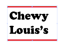
I started to design possible colours, texts and names for my title of my cereal brand. After looking at my designs, i decided i would take forward the name Chewy Louis's. I would have it in some sort of a rainbow coloured text, signifying the 'fruity hoops'. I then went into illustrator and started on my design.

I started off with writing my text using the text tool (below) Then scaling it to the desired size i wished to have it.


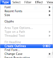
I then created the outlines of the text, by clicking on type > create outlines


I then drew out a rectange, with a a colour of red, then i dragged a duplicate by holding the alt button, to the bottom of my text.


I then did, whilst selecting both rectange, Object> Blend> Make, which gave me a line of rectangles covering my text.


                                                             Loads of rectangles covering my text


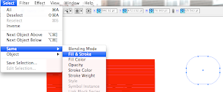
I then created a new shape setting its default Background and Outline colours to Null. Then i went Select> Same> Fill & Stroke


I then clicked on the rectangles and deleted
all the parts that surrounded my text, which i did not need.

Lastly, once i had all coloured rectangles within my text.


Project Development

Today i created my animated character that i will place on the front of my cereal box. I also may place it somewhere else, but a small version. I created my character by simply tracing the image, using a pen tablet. I used the pencil tool, to trace the image, and the image below shows you this. After creating the image, i literally filled in the different shapes/parts of the penguine with colour. You will see the pencil tool is highlighted.


Tuesday, 20 October 2009

Class Discussion/seminar

After having a a seminar with the class, i have noted down some useful ideas to include in my sketchbook, which will help me to create my project.
Possible things to include:
Mind maps
Mood Boards- pictures all spread out like a montage (making connections) fruits? Colours? Diffferent cereal boxes?
Thumbnails- e.g. designing a cartoon character
Visualisation- one big thumbnail

Monday, 19 October 2009

Possibilities for imagery

I have started to look at possbile characters that i could place on the front of my packaging. After researching all the cereal boxes, it appears to be very popular to include a sort of cartoom/animated animal object on the front of the boxes. This is due to the fact of attracting the typical young age children who enjoy this. Here are a few clip art animals i found of the net, which i could


Other possible packaging/boxes

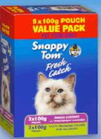
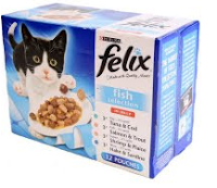
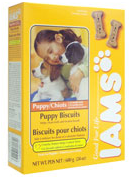
 Here i have looked at some other types of packaging in comparison to cereal and game boxes. This is to gain a wider base of knowledge on the consumer, marketing and packaging techniques.

Cat food: Waitrose.com


All the cat boxes use the same graphics, obviously as it is only aimed and meant for one animal. They use different colours depending on the flavours that are inside. Each brand has a different layout, which tries to attract the audience. In my opinion the one what stands out to me is the IAM's box, as it has that distinctive logo, which is the cat-like paw, which looks effective.

Soap Boxes: sainsburies.com


Colours of soap powder boxes play a large role into this when being designed. Green tends to mean that it is a Bio powder, Blue generally means Non bio, and a red/purple means colour. The logo is the key focus on all of these boxes, helping consumers locate their favourite brand and also making it stand out on a self.